A user interface (UI or GUI: graphical user interface) is how a user interfaces with (uses) a software application. Second Life's UI is fairly complex and has many elements and has had a few overhauls (redesigns).
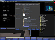
SL 1.10 UI (with slightly modified colors.ini)
SL 1.9 UI
UI Elements[]
Top Menu Bar[]
This is the menu at the top of the screen which includes the main menus and other information:
Menus[]
Other[]
- Menu Bar Information - Contains resident's location (parcel name and sim coords), current PST/PDT time, resident's Linden Dollar balance, and packet loss/bandwidth indicators.
Chat Bar[]

SL 1.10 chatbar
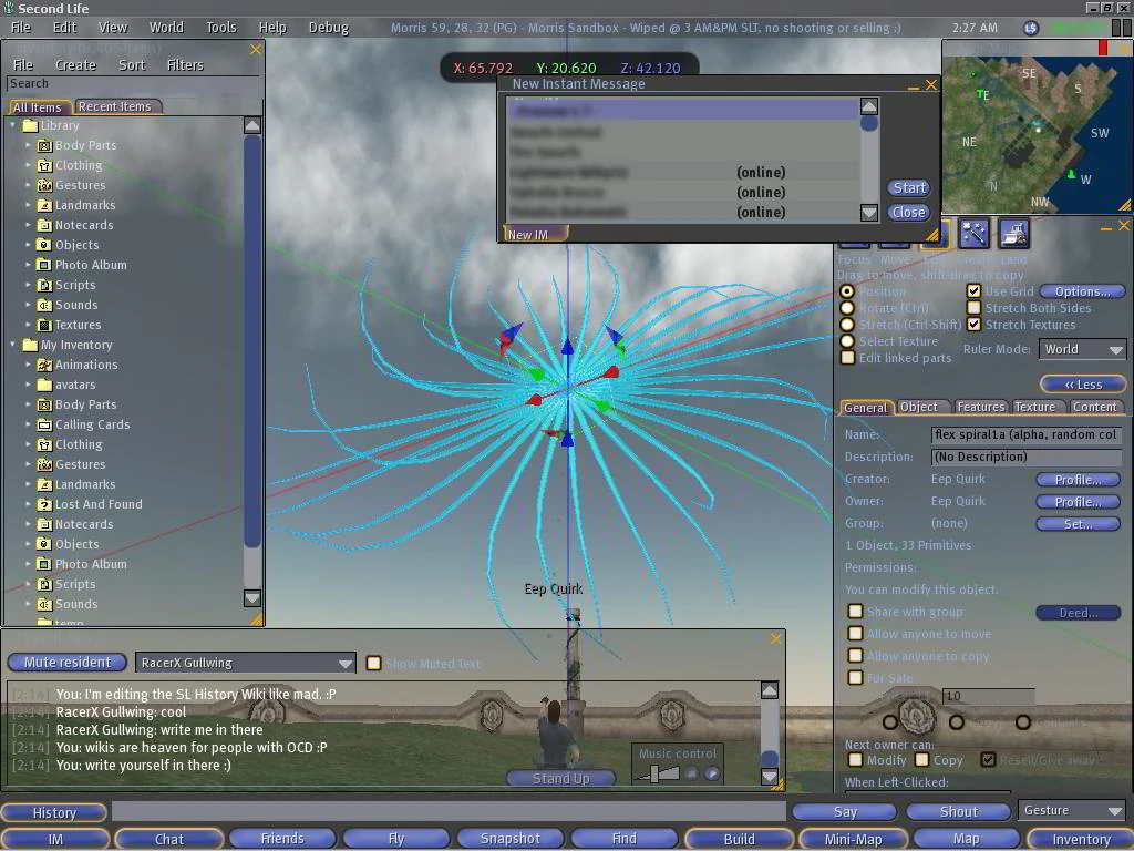
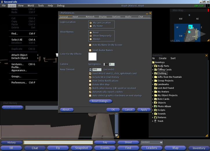
Located at the bottom of the screen, above the toolbar, the chat bar contains buttons and other features needed for chat interaction, and can be set to show/hide when the resident presses enter (via Preferences > Chat). The chat bar includes the following options:
- History button (shows/hides Chat History window)
- Text box for chat entry
- Say button
- Shout button
- Gesture drop-down menu
Toolbar[]


SL 1.10 toolbar
The toolbar is shown on first startup of SL, is located at the bottom of the screen below the chat bar, and can be hidden/shown by going to View > Show Toolbar. The toolbar includes the following buttons:
- IM - (Instant Messaging)
- Chat - The chat bar is opened and given focus.
- Friends
- Fly - Avatar is put in "flying mode".
- Snapshot - Takes a snapshot (screenshot) and opens the "Snapshot Preview" window.
- Search
- Build - Opens the edit window in "Create" mode.
- Mini-Map
- Map
- Inventory
Windows[]
A window is perhaps the most basic, common UI element--and SL has lots of them:
- About Window
- About Land Window - Displays information about the land a resident is on and can be used by the owner of that parcel to edit the various options for the land.
- Account History Window - L$ transactions and predicted amount for next stipend are shown.
- Appearance Window - avatar appearance
- Control windows - movement (avatar and camera), streaming audio/video
- Edit Window - Used for changing camera focus, moving physical objects, creating/editing prims, and editing land. There is a also a separate script window.
- Gesture Window - Create, edit, and delete gestures.
- Groups Window - Change "Active" group, edit groups, and view other options.
- Inventory Window
- Mini-Map Window
- Muted Residents Window - Residents or objects that have been muted.
- My Land Window - Shows parcels owned, their locations, how much land is there, and more.
- Preview Windows: Animation Window, Snapshot Window, Texture Window
- Profile Window
- Region/Estate Window
- Report Abuse Window - Report abusive behavior.
- Report Bug Window
- Script Window
- Script Search Window
- Script Errors Window
- World Map Window
Basic Elements[]
These basic elements (mostly controls) are used throughout UIs:
- button (normal, radio)
- checkbox
- cursor (text and mouse): mouse cursors change when in edit mode and depending on an object's left-click touch property
- dialog box
- folder: used mostly in the inventory
- icon: used mostly in the inventory, map, and find window
- image - general UI graphics, texture thumbnails, icons, controls, etc
- list (drop/pull-down), "listbox"
- menu (context, drop/pull-down)
- pane - a section of a window, like the 3D ("world") pane or edit window
- panel - a slide/pop out pane
- scrollbar
- slider: used mostly in the appearance window and preferences
- spinner: up/down buttons, used mostly in preferences and the edit window
- tab: used mostly in the edit window
- text
- window
UI Overhauls[]
There have been three major overhauls to the interface:
SL 1.0[]

The Green 1.0 UI
The first SL UI was a forest green color, was much more spread out, and allowed more of the world to be seen, giving a more open feeling.
Top UI Features[]
- Menu Bar
- File
- Edit
- View
- World
- Tools
- Help
- Debug
- Buttons
- Mouselook - Put the avatar into mouselook mode.
- Snapshot - Immediately took a snapshot and uploaded it for 10L$; no Snapshot Preview window.
- Find
- Leaders - Opened the Leader Board window which displayed the "Top Leaders" of things such as property owned, calling cards, L$ balance, land owned, and some other categories.
- Map - Toggled the mini-map which had a World button that launched the world map.
Bottom UI Features[]
This was split up into two "layers".
- Upper Information
- Resident's L$ Balance
- Sim name, sim rating (Mature or PG), and sim coordinates of the resident
- Bandwith and Bitrate Indicators
- Lower Chat
- IM button
- Text box for chat entry
- Say button
- Shout button
- Escape Chat Mode Button (this button toggled from Chat mode to Movement mode, essentially a manual button that did the same thing when you press Enter and have "Enter leaves chat mode" from Preferences > Chat enabled)
- Inventory
Other Major UI Features[]
- Mini-Map - All residents were represented by white squares ("you" by a green square), a "More >>" button allowed for you to show/hide more options, a "World" button opened the World Map window, and two bar indicators one for Primitive Usage (showing how close the sim was to reaching max prim count) and the other for Land Usage (showing how much land was available in that sim).
- World Map - Had four tabs: "Terrain" showed all objects in world in dark grey blobs, "New Objects" showed new objects in the world represented by white blobs which darkened over time, "Objects For Sale" showed objects for sale in white, and "Land For Sale" showed land for sale in white.
SL 1.2[]
The Blue 1.2 UI
Version 1.2 saw a complete update of the interface, with new blue buttons and a dark grey backdrop. This new interface gave SL a much darker and gloomy feel, as well as covering more of the 3D view, but it was also greatly more organized and intuitive. The tab interface elements were changed from a tabular style to some sort of button bar style, this was later changed back to the actual tabs we have today.
The top menu bar was extended across the whole screen, all buttons were moved to a new toolbar placed at the bottom of the screen, and information such as sim/parcel name, L$ balance, and bitrate/bandwith were moved to the top. The chat related features were all put into a chat bar which could be shown/hidden on Enter keypress (if enabled via preferences). This interface was much the same as the current UI with some features being added later.
Menu Bar[]
- Menus
- File
- Edit
- View
- World
- Tools
- Help
- Debug
- Information
- Sim Name, Sim Rating (Mature or PG), Parcel Name
- Resident's L$ Balance
- Bitrate and Bandwith Indicators
Chat Bar[]
- History button (toggled Chat History window)
- Text box for chat input
- Say button
- Shout button
- Gesture drop-down menu
Toolbar[]
- IM
- Chat - Toggled the Chat Bar to show/hide.
- Fly
- Snapshot - Took a snapshot and uploaded it for 10L$ with no Snapshot Preview window.
- Events
- Find
- Leaders - Opened Leader Board window
- Map - Changed to open World Map
- Inventory
SL 1.6[]
From SL version 1.2 to version 1.6, many small changes were made to the interface. Tweaks such as button positions or changes to button/menu art were made. SL 1.6 was in large part the culmination of these changes, with few changes having been made since.
Mentioned briefly is some changes made between version 1.2 and version 1.6. Some tabs were changed from tabs that went across the top of windows to tabs that went verticly on the left side of the windows, examples are in the preferences window and "Account History" window. Other tabs were changed from the "tab-bar" style to more tabular looking art, all tabs were colored purple. All buttons were left blue, but had the shading on them improved, and when pressed became highlighted in orange. When hovering over elements (check boxes, radio buttons, buttons, etc.) they became highlighted. Scroll bars and tooltips had corners rounded ("for your safety"). When the Chat History was closed, all chat was given a transparent black bubble-like background. Inventory search, chat bubbles, improved World Map with color, and many other features were added.
The Future[]
One of the problems with our current UI system is that it is all hardcoded to some degree and is very difficult for even us to change... time consuming. So we really want to make it easier on ourselves. And, in the process, open up the ability to skin and modify the UI by the residents. The plan is to make the UI more data driven so it loads some config files (XML) and builds the UI based on what they say. If it was totally data driven, then much of what you want could be done. But not all... like detachable windows would be extra stuff, and would have to come later. (Andrew Linden, ~9/18/05)
...there are a lot more UI changes for textures/materials coming in the future, and I'm sure it'll be much more intuitive when we get it all sorted out. (Yedwab Linden, 4/17/06)